Wednesday, 30 April 2014

OUIL406 Evaluation

1.  What skills have you developed through this module and how effectively do you think you have applied them?
Through this module I have developed many different skills. Probably the main skill that I have gained from this module is my skills on illustrator and even photoshop. All of my final pieces were produced digitally. Another skill that I have developed was that I learnt to juggle many different things at once due to the nature of the module, although this was not my strong point, I never fell behind nor did I miss any deadlines. Rather, I internally struggled to juggle figuring out the workload.


2. What approaches to/methods of image making have you developed and how have they informed your concept development process?

Especially on the last brief, creating lots of thumbnails and figuring out a solution whilst doing lots of drawing has helped me a great deal. It helped me to come up with more interesting and ideas. Using a pen to create ideas forces you to be purposeful with your drawing which creates quick and striking scamps. This helped me to work out compositions and layout for my designs. 


3. What strengths can you identify in your work and how have/will you capitalise on these?

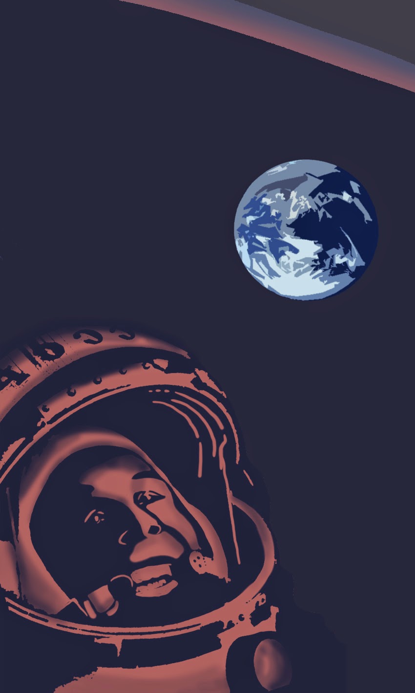
I really like the gradients that I have been working with, especially in the last 2 projects. They have helped to improve my work a great deal and I have learnt a lot from them making me try out new things. I definitely want to work with gradients more so definitely for the next few pieces of my work, I will use these and build on my skills. Another strength is that I have been working predominantly in shapes, this has given my work a new feel compared to the start of the year and has made it more interesting visually.


4. What weaknesses can you identify in your work and how will you address these in the future?

Something that I found difficult about this module was that it was very demanding as there was other modules and deadlines going on at the same time. This meant that I struggled to focus and distribute my time just because my schedule was generally very busy despite time management. Another weakness was that I have probably not took enough risks with my process of producing work. I feel that although I am trying out new techniques and processes, my finished work is not evolving very much. To help resolve this, I feel that I probably need to think through my idea more and also inform myself more than I do already from other illustrators work before I respond to a brief. 


5. Identify five things that you will do differently next time and what do you expect to gain from doing these?

1. Try a new way of working- not let things look the same as my other pieces of work- this will help my work evolve and not stay at the same level it is.
2. Probably plan out my time a little more- instead of a day by day plan, a more detailed hour by hour plan could be good to organise my mind a little bit more.
3. Simplify my work- this will cut down on a lot of work and help me to work 'smarter', the work itself will be much more effective if carried out properly.
4. Try to not be too literal- my postcards definitely show my 'literal' way of working, I would like to employ puns into my work and clever use of combining imagery- a bit like the work of Jean Julien!
5. Blog a bit more- be more reflective. This will help me to organise myself in my work and help me to notice where I am going wrong and what is working well. 


Monday, 28 April 2014

Final Poster

Here is my final poster design. I feel the feedback I got on Monday's crit, has helped me to understand what changes I needed to make. I knew that it didn't look quite right but I wasn't sure what to do about it. I have changed a few colours, toned down some and took out the line work in the face so that it suits the overall look of the image. My favourite part of the poster is the bottle, I really love how I have used tone, subtle colours and shape, I  dowish that I felt this way about the rest of the poster! The space suit is too flat looking- I was not sure how/where to add tone and each time I tried this, it looked strange and overworked. 

Development of Yuri's face


Throughout the development of the poster, I have been making small changes to Yuri's face. I feel it has definitely improved over time. In Monday's crit, I was told that his face didn't really look like him and had too much line work compared to the mostly shape work in the rest of the poster; therefore I have made a few changes. I changed the face to shaped and added gradients, I then put a helmet visor over the top because I feel that it's more subtle.


Final Stamps

These are my final stamps. Originally I planned on having these as my postcards and my now postcards as my stamps. I chose to swap them around because my now postcards were much stronger and complex than these stamps. These stamps are nice and simple- mostly made up of shapes and the same colour palette. 


Sunday, 27 April 2014

Poster development

I am not too happy with it because of a wide range of things. The palette of colours that I have used is quite strange, I have tried to change parts of the poster so that it is more balanced in colour but I have struggled with this a lot. I also dislike the 'controls' that I have drawn- looking back, I should of made them into shaped rather than having the purple line separating them. I feel that there is a strange mix of 2D and 3D drawing. This was not intentional but retrospectively I can see that it looks a little weird. I have tried to incorporate the typical Russian cuisine into my work- having a Russian friend to ask about this was really helpful. I think I may change some more things so it lines up with my other postcards and stamps more.


Wednesday, 23 April 2014

Cow and People Stamp Development


Here is the development of this stamp. I changed the colours to suit my colour scheme and then switched the people to a pink to make them 'pop'.

Tuesday, 22 April 2014

Final Postcsrds


I'm super pleased with these postcards. I wanted to achieve some really nice gradients and postcards that as a set, they really demonstrate Yuri Gagarin's space venture. The stopwatch demonstrates the time spent in space, the medal is what he received upon returning to earth, the calender showed the date on which he went to space and the space helmet is obviously what he wore (with the Russian flag in the reflection to demonstrate his patriotism). 


TV Stamp Development


This is probably my least favourite stamp because it's quite boring. I removed the rocket from the background as I felt that it would add to much of a story within 1 small stamp. I've kept it very simple and I feel that at a small scale it is acceptable. 


Rocket Stamp Development


I quite like this stamp design, I really love the background and feel that it creates a soft, space like atmosphere. This rocket is a replica of the rocket that Yuri entered space in. To improve, the rocket could be a bit more tonal but overall I'm fairly happy with it. 


Monday, 21 April 2014

Visual Language Evaluation

The Visual Language module has been probably my favourite module over the whole year. It is refreshing every tuesday be able to just 'make nice pictures' rather than concentrating too much on concepts and context. Throughout this module I have tried to disregard preconceptions on how I usually draw, or collage etc and just experiment and play to hopefully become a better illustrator as a result. 

1. Which practical skills and methodologies have you developed within this module and how effectively do you think you are employing them within your own practice?
Some of the practical skills that I feel I have developed is my printing skills, both screen printing, dry point and etching. In my own practice I am definitely employing the skills that I have learnt. The screen printing has informed many areas of my work as well as the textures that I have created in the print workshops. In general, I have become a better drawer which is always good.

2. Which principles/theories of image making have you found most valuable during this module and how effectively do you think you are employing these within your own practice?
The handouts that we were given in the sessions were very valuable (and the teaching), they led me to properly think about the way that I construct an image instead of just going with my first idea without considering composition. The visual language sessions, towards the end especially, have challenged me to add depth to my image and from this point and stop than from being flat and not really dynamic. From this module I have learnt more about my way of working and how i compose an image- for example, I tend to draw out the 'format' of an image in many different ways when planning a final image without being concerned how the drawing looks, but more the composition and how the image will be read when properly drawn out. 

3. What strengths can you identify within your Visual Language submission where you capitalise on these?
A strength of mine could be that I have done my best to put a lot of effort into each task. Instead of just doing minimum through this module, I have tried to make each piece like a mini-brief and explore this. I feel that my 'take' on each of the weeks has been very different from week to week- which I like. I have loved adding in texture into my work and since the week where we looked at 'shape and texture', I have included it into most of my pieces of work solely because it improves the work so much and makes it much more interesting. I feel that the best way for progression is to keep playing with different media and approaches and evaluating which are working well for me to build a unique 'way of working' that suits me and even becomes recognisable.

4. What areas for development can you identify within your Visual Language submission and how will you address these in the future?
Something that i definitely need to work with more is the composition of image and how your eye reads the image. For example, I often draw things sideways on naturally, so it is important for me to keep looking for exciting ways to draw. Towards the start of the module I found it very challenging to do the set amount of drawings for each week, this was probably because I was focusing too much on getting all the drawings done and them looking 'good' than I was on the task's intent. 

5. In what way has this module informed how you deconstruct and analyse artwork (whether your own or that of contemporary practitioners)?
This module has led me to looking at illustration in a new way- often when we had a 'line' week or a week when we were studying 'shape' or 'texture', I found myself looking at the world around me through this lens. I took photos of new, exciting textures, looked at objects and imagined them as a line drawing etc. Not only this but when I have been on illustration/design websites/blogs online I have found that I have been subconsciously asking myself 'why does this illustration work so well?' and trying to incorporate these ideas into my own work. 

The handouts have also helped my work, they have helped me see why some images work much more than others, the handouts have even informed how I read graphic design work. The colour theory lecture has inspired me to deeply consider colour in an image as it truly can determine the success of an image.


6.How would you grade yourself on the following areas:
(please indicate using an ‘x’) 

5= excellent, 4 = very good, 3 = good, 2 = average, 1 = poor

1
2
3
4
5
Attendance


x
Punctuality


x
Motivation


x

Commitment


x

Quantity of work produced


x

Quality of work produced


x

Contribution to the group


x


The

World Stamp Development


I changed the background to this colour to tone it down a bit more and make the world (especially Russia) stand out.


Testing

Here I was trying out ideas that I had drawn out in my sketchbook on Photoshop. They didn't make the final cut but they helped a lot with knowing what was working well and what wasn't. Fortunately I was able to reuse some of the components in these files in my final designs. 


Tuesday, 15 April 2014

Poster development

Here is the progression of the poster.

I have took out the texture on the suit because it is a bit too much. I need something a little simpler. I need to add some more stuff onto the 'dashboard' to make it more like a spaceship.

I feel the square window is too much like a normal window not like a spaceship looking window.


I've added some Russian food/drink here but I feel that maybe it is a bit too much.

Monday, 14 April 2014

Sketchbook Development

Here are some notable scans from my sketchbook. These are mostly quick sketches to work out what works best compositionally and what will look best for the poster, stamp or postcard. The thumbnailing was particularly useful for the stamp design.