In the interim cit it was addressed that I need to consider the colour scheme and how it works as a set- this is a notable point and I will definitely look at this. Also it has been noted about the need for a consistent colour palette, this is something I will definitely consider.
Saturday, 29 March 2014
Thursday, 27 March 2014
Poster progess
I have started to work on my poster. I am working from my initial drawing in my sketchbook (in previous post). So far it is going well. I am not sure about the colours yet so I feel I will have to keep experimenting with them.
Colour, Value & Notan
This is my response to this brief with the corresponding colour palette that I used. I have tried to balance my use of light and dark. I'm not completely happy with my response to this task because i don't think the image is very dynamic despite my use of gradients and different depths. I tried to make this image really interesting by showing a reflection in the camera lens and by having it really close up to the figure but I don't feel I achieved what I wanted. To improve I would of probably picked another angle or drawn my figure with more tone. Something that went quite well was how I feel i have balance my left side of the image with the right (colour-wise) then I have tried to incorporate the rule of thirds.
Here is the progression of my idea.
Thursday, 20 March 2014
Well good illustration from Geoff Mcfetridge
I love the shapes here, the clean lines, the curves. Although these are paintings, i feel that this kind of aesthetic could by achieved from using the pen tool on illustrator. This work reminds me of Olympia Zagnoli but with a nicer palette.
Tuesday, 18 March 2014
Line of Sight- Transport
This is my response for this mini-brief. I wanted to add an interesting and dynamic line of sight with the constraint of it being monochrome. I feel my response is ok, there is a nice depth although the line of sight is not as dynamic or definite as i would of liked. I do really like my background and gradient here though, this is something that adds to the image and its depth a great deal.
Below are some tryouts of other monochrome colours- preferred the red as it was much warmer and felt like a happier picture as opposed to the cold blue.
Friday, 14 March 2014
Tuesday, 11 March 2014
Development
Saturday, 8 March 2014
Cities Famous for their Transport
After having my peer feedback talking about 'refining my work', I feel like narrowing my focus down a bit would be beneficial to the success of the brief. I have chosen to look into famous transportation from around the world. This transportation is instantly recognisable to the city- I will definitely capitalise on this.
Dehli- Auto Rickshaw
Venice- Gondola
Paris- Bikes
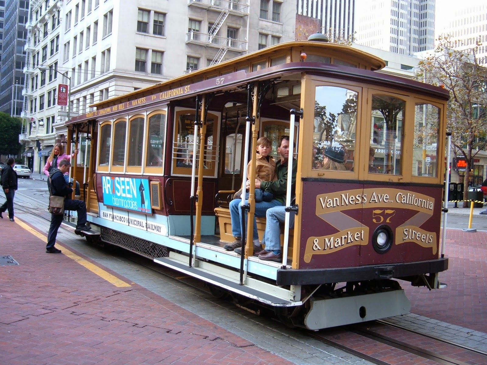
San Francisco- Cable Car
Friday, 7 March 2014
Peer Feedback
Some very notable points made here that I will consider. I am going to do some more research and see what I come up with regarding 'refinement'.
Development of postcard brief
Here are a few drawings from my sketchbook. They are my initial ideas. I'm not too sure if I like them though. I feel that they are lacking something.
Thursday, 6 March 2014
Initial Response
Here is my initial response on illustrator to this brief. I'm really pleased with my response, I feel that the gradients and drawing have worked really nicely.
Subscribe to:
Posts (Atom)