Wednesday, 18 May 2016

Summative Statement

My rationale for this project was fairly simple. I wanted to improve my problem solving skills, my drawing skills and my professionalism in my practice including having a clear ‘tone of voice’ in my work. This will help me to solve briefs in ways that are creative and not cliche, it will help me communicate better and help me to be more recognisable in my work. This will deepen my understanding of illustration and establish my practice more and as a result I will feel like I have achieved something really exciting and am proud of. 

I feel as though I have achieved what I set out to do in the rationale. In my rationale I also detailed some themes and subjects ("light hearted, colour, texture, people, nature (trees/landscapes/fish/insects), geometry") that I would aim to look and and I have fulfilled every single one of them. This gives me a lot of confidence in my work and myself. 

I wrote in my rationale that I wanted to make informed decisions in order to enlighten the work and keep it relevant. I feel as though I have done this almost throughout, there are times where I probably didn't consider external influences enough. However I could argue that those times were intuitive, as many moments of deep creative thought are. 

Throughout my work, there has been a link between this rationale, my research and my practice. Each of these have informed one another and vice versa to create a more synthesised body of work. I also wrote in my rationale that I wanted to create work that establishes my practice more and more importantly makes me proud. I am glad to say that I feel I have achieved that; I have produced some work that I can put in my portfolio and would be proud to show to potential clients and agents! Overall I have satisfied the points written in my rationale and exceeded my own expectations of this module.


Project Report

Brief 8 - The City Talking Boards

Sunday, 15 May 2016

Statement of intent PDF

Photos of final prints

These are some photos of the final prints. I am happy with them and feel like they would do well being sold in the Natural History Museum or in other places where the Amazon rainforest is of interest. I printed them onto 310gsm Harman fb paper. This paper is top quality to suit these bespoke prints.

More about the paper and why its so lovely:


"HARMAN PHOTO Matt FB Mp inkjet paper is a premium quality microporous paper on a true photographic fibre base. It is designed to produce instant dry high quality images on a wide range of photo- dedicated inkjet printers, using dye or pigment inks. Uniquely the paper incorporates a layer below the ink- receiving layer called Baryta. Baryta is a special coating that is traditionally applied to fibre photographic paper base prior to coating with the emulsion layers. The technical benefits of this layer include greater detail and definition, extended tonal range, and excellent archival properties. In addition Baryta coated fibre papers have a unique look and feel which have become the standard for fine art photographers worldwide over the course of more than a century. "

Time management

I created a time plan a few weeks back. I am proud to say that I stuck to it! - Mostly anyway.

You can see it here: http://o-newsome1316sp.blogspot.co.uk/2016/05/change-of-direction.html

I noted down a lot of time for spending time on brief 3 however I really pushed myself to finish the brief early (the practical work). So it was great to get this out of the way so that my focus could shift onto the project report and the boards.

Running ahead of time has really helped me to be calm about the submission. Although every submission becomes tough right before hand-in, I can be confident that I did not leave lots of work to do at the end, but instead spread the workload out.

My time management throughout the whole module has been good I feel. When deadlines come up- like crits and tutorials, it forces me to make work. Its almost like my practice and workload is like a steady wave on the sea (not like a crashing storm wave) but a wave that builds and falls in rhythm with the world load at hand. I'm not someone who doesn't work for a week then works like mad because the pressure is on.

A problem that I did have with time management, particularly towards the start of the module, was knowing the right balance of time for each module. I set aside days for each module like Fred suggested however crits/ deadlines/ meetings would pop up and throw off the whole schedule. At times when I was doing this module, i felt like I should be doing another module's work and vice versa.  Once the COP module was out of the way, I felt like I could focus a lot more as that took a lot of my time, energy and brain-space.

Something that I wish I had done differently with my time was I wish that I had of spent my easter a bit differently. Although I was doing uni work pretty much every day, my focus was on PPP. In hindsight the weighting of that module to this module is almost insignificant in comparison and therefore I should of spent 1 of every 4 days on PPP and the rest of the time on this module.

Final prints

Here are all the different prints in their relevant sleeves. I had trouble getting an a4 plastic sleeve for the prints. I managed to get a a5 sealable sleeve for the prints however it means that I had to cut all the work down. I tried it with a test piece to see how it would look and it just looked terrible in comparison to with the nice medium size border. As a result I just went ahead and put the prints in the paper sleeves.

If i had more time I would of liked to have bought some a4 size sleeves. I looked at getting these on sunday but nowhere on amazon could deliver them before the deadline thursday. This was strange, I looked in the works too however they only have a5 sized sleeves for prints.

Friday, 13 May 2016

Final book covers

Here are the final book covers for my work. I am really happy with how they have turned out. Although this was a tough process of idea generation, layout and figuring out the minor details I feel like the final cover looks really good and could actually be produced and marketed. 

If i would of done anything differently I would of maybe tried playing around with textures. It would be really cool if the motif was raised (flock printed) or if simply just felt different to the rest of the cover. This little detail adds character to the book and makes it special to the buyer. It causes people to treasure a book and keep it on the shelf rather than just read it and move it along. This is the reason why I designed it so that all the page edges were coloured; like in the Twilight saga books that I detailed previously. Although the attention to detail costs a little more in production costs, it means that the book is set apart when it is on the shelf from the other books around it. Personally I feel that the extra costing is more than worth it and will become a collectors item for those who have already read the books. 

All pieces

These are all 30 pieces of work! I have printed them all out but I thought that it would be great to have an online documentation of them all. I am very happy with the way that they have all turned out. I had a few struggles with choosing colours that worked well but after lots of trying and testing I feel I got there in the end. There are a few pieces that now looking with a bit of hindsight I would probably change however on the whole I love them. I feel that whenever you create a big body of work there are always 1 or 2 pieces that don't quite meet the standard and that is fine. With a bit more time (and patience) I could probably improve on these pieces however I feel that I need to devote my time elsewhere and invest into other area on this module.

And just so that is clear, here are each of the illustrations in their categories. You can see how they look as a set.

Pieces for the end of year show

These are just some test for the end of year show. I am going to take them from this brief as I feel it is my most successful one. I have 2 options above, either 3 x a2 and some smaller pieces or 6x a2.

Final products

 Here are the final products that I have made for this brief. I have made a pack of stickers for each set, a set of limited edition leather notebooks (just 3 of each design - 90 notebooks in total), the set of bespoke prints and also a pack of info cards.

The leather notebooks appeal to the same audience as the bespoke prints, they are a limited edition product which means that they can become more of a collectors item. I have not produced these due to the cost of getting these printed.

The prints are to be kept in a transparent plastic sleeve and held together with a paper sleeve where appropriate. The prints are digitally printed onto high quality matte Hardman FB stock. They are available to purchase either as a singular item or as a set (as pictured above) and will be purchased in the Natural History Museum shop onsite and online.

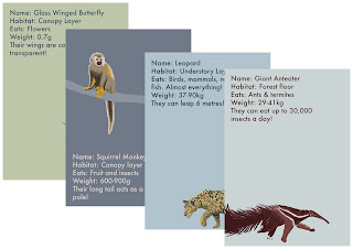
The children's activity cards are designed to help children to learn about the rainforest plants and animals. These will be targeted towards children ages 5-8. These cards also have potential to be used in schools as part of the curriculum. I have only proposed these cards as making them would be very time consuming and costly.

I wish i had a bit more time to expand on these products a bit more by creating more promotional work for them. However, time is of the essence and there is a lot of work to be done.

Final Floor and Wall Decals


As part of my brief, I had to create some wall and floor decals. To actually make these would be a highly expensive and almost unnecessary experience.  Instead I have mocked them up. I feel that in the second image I got a bit carried away with the stickers but you can get the picture. I feel that these massive stickers in the 'Images of Nature' exhibition could just bring it to life, especially for children.

These stickers could also be sold to places like 'The Rainforest Cafe' London, Tropical World Leeds, Edinburgh Royal Botanic Garden's tropical area and even in schools/nurseries. Upon leaving university I am going to look into selling these designs for this very purpose, I feel like there is definitely room in the market for something like this to be sold to people in this sector.

Thursday, 12 May 2016

Print Sleeve/cover

This is the cover/sleeve for the work to go in. There are 5 different sleeves each with the relevant name on in blue (insects, birds, mammals, reptiles and plants.) I really like this sleeve. I took it directly from the work that I did for the screen prints and just reused it for this cover. 

I have since had some really good feedback on it in the group crit which is great!

Trouble printing!

Wrong side of paper                                                              correct side of paper
So i had an absolute nightmare printing my final pieces!!! I booked a print slot way in advance for 6pm yesterday. I came in at 5:55pm, loaded up my work and did not get seen until 7:30pm. The person who was running digital print was extremely slow. She then started on my work and sent it to print. She didn't realise but I realised- she had put the paper in upside down so it was printing onto the wrong side (see images above) and resultantly the images came out very grainy and blurry. 

She printed my work again but there obviously wasn't any yellow ink left in the machine (see first image). I pointed it out to her and by this time it was 8:30. In the end I left when the college shut at 9pm with no prints. She said she would print them for the morning- I came back this morning and only half was printed. Now I need to go to drop in because there are no other slots and James can't fit me in. 

This is just added work for a problem that was not my fault so it is very frustrating. 

Wednesday, 11 May 2016

Wall stickers for exhibition

Here is a mock up of the wall stickers for the exhibition space. They are not finalised yet but you get the idea. They will accompany the work that I have previously spoke about (Bauer Brothers Exhibition in Natural history Museum). I think that at the moment they are probably too 'busy' on the wall. With some more tweaking and space to breathe I think they could look really good.

I have done some research into the different types of materials that you would use for a product to be printed onto walls. I found a website which explained it quite well. If I were not just proposing this idea, I would most likely find out more information from this company about getting an offer on a bulk buy of wall stickers. 

Tuesday, 10 May 2016

Hunger games final prints

These are my final prints for the Hunger Games book covers. I am really happy with how they have turned out. I printed onto high quality 300gsm Snowdon paper; it is off-white with a little texture- overall a great feeling paper, especially for these bespoke prints that I have produced as special collectors prints. 

Competition results

Unfortuntately I didn't win the competition! This is ok though, just having the opportunity to have a paid for trip to Romania was amazing!! I have learnt a lot from doing this brief about image creation, my interests and the country of Romania. I am really glad that I have took part in this competition, it has given me some faith that sometimes it does pay off to enter into competitions!

This is the winning artwork. The winning artworks for the other building and Corvin castle both won by making an interactive animation/app. Personally I don't like the aesthetics of the winning entry (see link below) however I can see why it won as the concept is much stronger. 
http://www.e-darts.eu/contests/digital-art-competition/artworks/adela-muntean

Making images stronger

I have been working into many of my existing pieces as they were not strong enough to exist in a set and 'hold their own'. I have helped pieces to become stronger by using a less saturated background and also by working into the subject more with brush strokes and colours to create a more dynamic image. In my opinion I feel like it has helped it a lot. I have done this to various images but this is just one that I have picked out to show the example.

Penguin Book covers final outcome

These are my finished Penguin book covers. I am pleased with how they have come out. I printed them onto 300gsm Snowdon paper which is a great quality paper that feels lovely when you hold it. The brief itself was to create some book covers however these print would also be great to buy to hang in your house for those who love to read books/those who like nice book design.

Monday, 9 May 2016

Progress on final pieces

These are my images so far for my final brief. There are some pieces that are much stronger than others in terms of composition and colours. I feel that what would be good for me is to go back into the images and adjust the colours so that there is more of a contrast between them and therefore are stronger as a set. I have put together some of the best pieces so far so that I can see what is good about them and capitalise on them for my other pieces - see below.


Things that are good about these images:
- Muted colours combined with stronger colours
- range of compositions
- complementary colours
- brush quality
- consistent block backgrounds

Here i have gone back into these pieces to make them stronger and work better as a set. I don't think that my work is done at all yet but they are getting there. I'm not sure how to describe it but they don't all 'pop' yet. I want them all to work very well as a set and they do not do this yet.

Friday, 6 May 2016

Penguin Design award

I have looked into the Penguin Design award and unfortunately I did not get shortlisted. This is a shame but I feel I have come up with a good body of work (my other penguin books) just out of this competition so its alright.

I have seen some of the work that was submitted from other people in the class and I'm surprise that nobody in our year was picked! It seems quite a shame. I am excited to see what the winning covers look like!

Wednesday, 4 May 2016

Brief 1- Final pieces

These are my final pieces from the editorial brief (brief 1). I am glad to complete them and feel that I have succeeded in doing what I set out to do. My original rationale for this, in brief, was to explore the realm of editorial illustration more as it is of great interest as well as helping build my creative thinking/concept skills and get me used to working in a short time frame by creating each piece within a 24 hour window.

Though they are all from different news stories, they are all from the New York times newspaper as well as all having the same strict colour scheme. I have also worked to strict frames to reflect how it could be when doing it for real. These frames are a square, letterbox, spot illustrations, creative op-ed style and a double page spread. I have enjoyed having these constraints around the work and this speaks volumes about me and my practice. It also is a reason why editorial illustration is so good for me to pursue. As I am not a graphic designer, these designs are not excellent with the layout/type however you can get a good idea. This job wouldn't be mine to do anyway so I am not particularly worried about it.

Insects

I have begun to transfer my screen print designs over from that document to new ones- alike to the previous post about the birds. I like these designs but I feel that as a set that they may not be strong enough. I feel that maybe going back into them and changing the colours so that they contrast well against the background would be a good idea.

I do however really like the bottom left insect, the contrast between the background and the insect makes it stand out and become a strong image, especially compared to the rest.

Tuesday, 3 May 2016

Change of direction

After the tutorial I have decided that it would be a good idea to not screen print my main brief due to the process of screen printing being a great task (5x 3 colour separation prints). Choosing to not sreenprint frees up a lot of time in my schedule meaning that I can pursue this brief and other briefs on a deeper level that benefits me more.

As for the progress, so far I have completed:
Brief 1- Editorial
Brief 2- Penguin book covers
Brief 4- Digital Arts competition (Romanian castle)
Brief 5- Hunger Games Covers
Brief 6- Engineering colouring book
Brief 7- EP cover for Fight The Dice

I still need to work on brief 3 (main brief)
I need to present my editorial work better
I need to present the Darts brief
I need to present the hunger games brief more

In the tutorial Fred encouraged me to print out some of my work so there is a physical body of work to submit. I agree with what he said in the tutorial

I have made some progress on the boards for the briefs that I have completed however they are taking a while to complete.

I have created a timetable to plan out my focus for the next 3 weeks. Some of these days will be subject to change if anything else crops up- however this is the direction that my work will take nevertheless.

Birds

Since changing my process for the final outcome of this brief (from screenprints to digital prints, I have begun to take the idea back to basics and see what would work and what wouldn't. I realised that some of my work that I have created previously for the brief like the images below actually worked really well. The digital process is a big part of my practice so creating a digital print for the final show fits in completely with who i am as a practitioner.


Peer Review Feedback

Feedback from peer review:
Knowledge & Understanding: Research
- More contextual research
-PDF articles on blog so its easier to go through
-Break things down

Cognitive Skills: Problem Analysis
- Explored visuals routes can take
-More development about process e.g sketchbook work

Practical and Professional Skills: Visual Quality
- Your strongest work is when you use shape and a simple texture
- Can see that you are starting to capitalise on it.
- Presentation just needs to be a little more detailed, e.g constant size etc

Practical and Professional Skills: Technical Competence
- Explored colour and shape really well
- Clear tone of voice
- Would be nice to see some final outcomes printed professionally
- Print articles in context
- Put images in ISSUU

Key Transferable Skills: Evaluation
- Write about each image break down the evaluation to make it more coherent
- Continue to self evaluate
- Explain how you got to that point

I agree with most of the feedback given, it has been really helpful to be shown these areas that I need to work on and improve as I have found it difficult to see these 'gaps' myself. I will definitely take on the feedback and change things accordingly.

Contextua reference

I came across this piece of work and although I don't really like the illustrations themselves, I feel that they show what simple stickers can do to a room. They can transform it from something boring and bland into something that is fun, creative and full of character. I feel that that is what I want my wall decals/stickers to do. 


Thursday, 28 April 2016

Book cover final set

These are all of the book covers as a set. I am happy with how they have turned out. They work really well together as a set. My thinking on all of these was to pick out some symbols in the books. I detailed in my rationale that I did not want to pick cliche symbols to show for the books; I think that I have achieved that. I also think that they work well together because of the consistency that runs throughout them all, the work focusses on 2/3 motifs and a background colour that suits the book (with care taken to not pick the same colours for each). I honestly feel that the colours suit the books so well and it was lucky that they work like that as a set. 

If i were to do more on this brief, i would of liked to of spent more time reading the books so that I could be more aware of the motifs in the books. 

This brief has showed me that when I put my mind to it, I can produce good looking book covers. This adds versatility to my practice and will show art directors/those looking at my portfolio more of a scope in my practice. 

The context for my project


This is the exhibition that I am creating my work for. I will create wall decals,, bespoke prints and products for the museum shop. 

Poster for hunger games book launch

This is my poster for the book launch of the hunger games trilogy. I had to use my graphic design skills (which i don't normally use) to create this poster- I feel that it has gone ok. I feel like it is quite simple which is good and maybe challenges the way that people look at the Hunger Games brand (the current brand is quite dated).

Leaves

These are some of the leaves that I am doing as part of my set of 5 screen prints. I am most likely going to add a few more to the page so that they is a breadth of leaves that are in the amazon rainforest that are being displayed. A challenge that I am having on this piece is that the leaves are majority green. This means that the screen print is going to be majority green! I feel that trying to seek out more colourful leaves might be the best idea- I have documented a few in this pice but I have a feeling that there are way more weird and wonderful leaves to help make the image 'pop'. 

I like the aesthetic that I am achieving with these screen prints- they are not as graphic as before yet still are graphic enough to be able to be produced as a screen print.  I did what I said i would try- I tried out the Kyle T Webster brush set to see if it made any difference - and obviously it did! I will continue with these brushes on this brief.

Screenprint- Insects

I have made up this 3 colour separation screen print for my main brief. I quite like how it has turned out however I feel that I need to add in more insects to the work to make it look a bit more full. I don't think that enlarging the insects would have the right effect as when printed at a2 it will just look strange I feel as some insects will be almost a4 size. 


Monday, 25 April 2016

Some sketchbook pages

These are a few of my sketchbook pages that I like. The sketchbook has really helped me to refine my idea and enjoy the process of drawing. It has helped me figure out what works and what doesn't. It has kept my practice fresh and given me ideas for my work. There are a few pieces that didn't work so well but they have been really good to learnt from.

Friday, 22 April 2016

Brief

BA (Hons) Illustration - Level 06
OUIL603 Extended Practice

BRIEF TITLE
The Amazon Rainforest
Brief
Create some informative yet playful products on the Amazon rainforest, (specifically focussing on 5 areas- mammals, insects, birds, reptiles and plants) for a current exhibition ‘Images of Nature’ at the Natural History Museum. Create 5x 3 colour screenprints.


Product
Tone of Voice
1x Set of 10 large scale wall decals
5x bespoke 3 colour screen prints

Extra products: Set of products for the museum shop
Fun
Engaging
Informative
Playful

Audience
Context
People interested in nature and botanical drawings
People who enjoy screenprints
People who visit the Natural History Museum- mostly targeted towards families


Natural history museum- walls, & shop


Could also translated for use in..
                                             A classroom
                                             Tropical world, leeds
                                             Exhibition space
                                             Interactive space

Additional information/Considerations


Mandatory Requirements
Deliverables
It has to be based on the rainforest
It has to appeal to the audience


5x Screenprints
10x Wall Decals- 2/3 metres tall
Set of products for the museum shop


Thursday, 21 April 2016

Dragonfly pattern


I took one of my notable pieces that I created previously and made this really lovely pattern. Although its not massively linked to the current stage of the brief, I just wanted to see how it would look. I feel that it would be a great piece of wrapping paper. I may have to pursue this on the side to this brief as I feel that it isn't in line with the current brief. 

Wednesday, 20 April 2016

City Talking- Finished product photos

In the end the city talking used 2 of my images (despite one being referenced in the article and it not being printed! ha). I feel that this was because my interview was joined with TONE and he only submitted 2 therefore it seems fair that I have 2 as well. It feels great to have my work actually in print as so far my work has only been published on online sites. It was also really good to have people get in touch with me for my work and because they have seen it out and about in Leeds.


Monday, 18 April 2016

Screen print of parrots

I have been making some progress on my main brief. I have chosen to do a set of 5 screen prints that illustrate the nature in the amazon rainforest. I will look at 5 areas:
1. Birds
2. Mammals
3. Insects
4. Reptiles
5. Plants
Above you can see the screen print preparation work. This work is designed using just 3 colours but allowing transparency for them to overlap to create an extra 4 colours- 7 colours in total. I am really pleased with how they are progressing at the moment, they look free flowing and natural to say that they are for screen print. I am happy with the colours too; I spent a lot of time testing colour palettes for colours that would overlap well however none came close to this particular palette.

The next steps are to keep preparing screen prints for each of these categories. Once I have done all of these I will move onto the actual screen printing- this may take a long time, it may be best to propose this and create it after the submission but before the end of year show. Or on the other hand I could just print 1 screen print as an example of how I will print the rest.

Darts Competition update

Here's an update on the darts competition, i am excited to see what the results are. There are a few really good contestants that I am up against!

Friday, 15 April 2016

Tutorial with fred

After the tutorial with Fred I feel as though I have a lot to do and complete before the submission. 

These are some of the notes from the meeting:

Hunger Games- need a range of products and window display
Need more books for Penguin- make it a range and a set of penguin classics
Document the colouring book event and collaboration
Rainforest brief- project needs more scope and ambition as discussed. Write a brief and consider wall art and installation. 

Evaluate more on the blog

I need to also add more pace to my work and explore briefs more in order to try and test different things to see what works and what doesn't. This will also make the work well informed. 

Tuesday, 12 April 2016

Bauer Brothers Nautral History

I have found the exhibition that I was looking for. I was wanting to find an exhibition that was about the amazon rainforest and this one is perfect. There is an exhibition on at the Natural History Museum called 'Images of Nature' and features the Bauer brothers. 

Creating large scale wall decals/stickers would be amazing alongside this work. It could provide a more rounded exhibition- the watercolours for generally the older people and the massive decals for the children to be inspired and occupied by. I will begin to make work for this more defined brief. 


All of the books


I have finished the book covers. Here is a mock up of how they would look when printed. I feel as though they are very effective as a set. This GIF could also be used in promotional work. I purposely not looked at promotional work on this brief as I cover that side on another brief that I am doing and also feel that this job would not be down to me as an illustrator- this would be down to the marketing team and art director. My job on this brief is to simply create the book cover for these books