Below is some key scans from my sketchbook of some of the concepts and ideas that I have come up with. From verbal peer feedback I have concluded the 3 ideas that I am going to take forward to produce the final piece. Some of the feedback that I got from the group crit is that I should use more colour in my work- I can agree with this statement.
Thursday, 31 October 2013
Wednesday, 30 October 2013
Photoshop Workshop 2
In my Photoshop workshops we have been working with manipulating images. Following on from last week's session I wanted to expand on the skills that I had developed and see how they would affect a more simple drawing of mine. As you can see, the outcome from this is appealing and shows consideration of line, tone and colour. The image is far from perfect but it was great to work with the Wacom tablet in this workshop. Some difficulties that I encountered during this was figuring which layer masks to use. For example, sometimes a good layer mask would be 'darker colour' and other times it would be 'overlay'; playing with the masks helped me to solve this problem and helped me to understand what the function and workings of that mask actually was. I feel that in this image I have kept the essence of the handmade whilst working digitally due to the line quality and brushes that I have used.
Tuesday, 29 October 2013
Line & Mark- Part 1
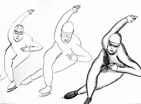
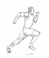
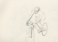
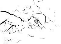 I have been looking at the use of line over the past week, I have been exploring exaggeration, simplification, plains and contours.
 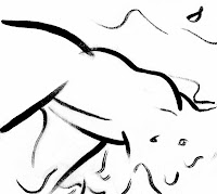 Over the past few weeks I have found out alot about the drawing process; that it is something that cannot be taught but can only be learnt through the means of drawing. Drawing can only be measured by its success by its maker - you yourself define a 'good' drawing and you define your way of working.
As we were asked to use 10 different tools over the course of these 2 weeks, I tried to allow them to almost dictate my drawing and explore their potential as mark making tools. Doing this helped me to understand how the media works on the paper and using it in different ways. For example, in the penultimate drawing, I am working in gouache and brush; this is something I have never worked in but I feel that the results are great. Exploring the potential here has led me to a place where I know that I now want to exploit this media further to see what more results I can get from this approach.
To draw these pieces, I have been working with reference material from the official Olympic website and a book called 'Sports in the 21st Century'.
The drawing opposite is my most successful in terms of learning; the mark making here is beautiful (see close up photo). It suggests flow, form and anatomy whilst also being fairly simple. There is a lot that I could improve on and develop (for example I could try show tone) and I will bear this in mind for my next drawings using this approach.
"Creative art begins with creative line. Creative line can only be the line as you see it and prefer to draw it. Projecting literal contours by and artificial means can only result in stifling your most valuable asset- individuality. Draw from copy as you would from life. Have always the courage to draw it yourself."
Andrew Loomis. 1947
Friday, 25 October 2013
Initials Brief- Photoshop
Here are my 5 photoshop images. This task was great for learning the software as I found myself finding out tools and processes that I previously never knew despite knowing Photoshop quite well. This is great for the future as it speeds up my methods and techniques when on this software.
To keep the relationship between the handmade and the digital going, I scanned in my 5 images and worked into them. I added textures that I had made/photographed to try keep a natural look.
Something that I found challenging on this task was the selection of different areas- layers were sometimes confusing but after a while it became really natural. Another challenge that I faced was making my drawings that I scaled up from a tiny size into nice clean lines, the Wacom tablets helped me to fix a few of these lines that didn't scale up very well.
Wednesday, 23 October 2013
Photoshop Workshop 1
From my photoshop workshop, I have scanned in my drawing that I drew for my Visual Language work and from using the tools that I have learnt about. I have started to play about with texture and colour by working into my image. The new skills that I learnt in this workshop made it so that it was quite easy for me to select and colour areas to emphasise certain places in the image. Here are a few of the images that I made. The original image can be seen in my previous blog post. I particularly like the image with the tweed jacket and the blue background- its charming. These images as a set reminded the photoshop guy of Warhol's Marilyn prints, this was not my intention but I can relate and I think I like it.
Tuesday, 22 October 2013
Drawing From Reference
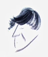
Here is a series of my drawings of the same person but using different approaches. For this same task I also created other drawings of a building that I saw in Berlin, a sheep I photographed at the Yorkshire Sculpture Park and a full length fashion shot of a man I saw in a magazine. These 5 drawings depict the reference material that I chose in different ways. It seems the ones that are the most unrealistic often portray much more character and are more interesting than the ones that are. I actually really like this and feel that maybe not caring about proportions too much but focusing in on showing the character of someone and maybe accentuating some features is a great way forward. Over the course of this task, I have looked at minimising information and simplifying it but also sometimes choosing to add in further information. This task has been all about testing and play for me.
Observational drawing forces you to study the object, 'draw' conclusions from it and then record it on paper.
In Richard Sennett's book, 'The Craftsmen', he compares drawing to that of a tennis player who practices her serves over and over; in the
routine that develops from doing something many times, one is able to
fully know the act, to explore and mature within it.
http://aworkinglibrary.com/library/archives/ritual_and_repetition/The Importance of Sketchbooks
"Drawing is the simplest way of establishing a [..] vocabulary because it is an instant personal declaration of what is important." Betty Goodwin.
More and more I am realising the importance of an illustrator's sketchbook. It is a window into their life and has a direct correlation with their finished work.
More and more I am realising the importance of an illustrator's sketchbook. It is a window into their life and has a direct correlation with their finished work.
Here are a few of my sketches that I have done over the past few weeks of the Visual Language module. I am really enjoying working with a range of media and trying out different approaches to portray faces, objects and people.
I am finding that the more you draw, the more you develop your own unique voice and approach. This is what will set you apart in the future from other illustrators as you have invested into and evaluated your own practice.
A sketchbook is a visual diary where you think, tell jokes, plan, inquire, play, be serious and have fun with.
In these drawings I have particularly focused on using ink and pushing my skills of this media. Quink ink is still a reasonably new media to me so I've been having a lot of fun testing it. A few of these tests are documented here.
In these drawings I have particularly focused on using ink and pushing my skills of this media. Quink ink is still a reasonably new media to me so I've been having a lot of fun testing it. A few of these tests are documented here.
"If drawing is the best way of establishing what is important to us visually then it must go some way towards recording what it important to us internally." Lizzie Stewart
Monday, 21 October 2013
Initials Brief- Outcome
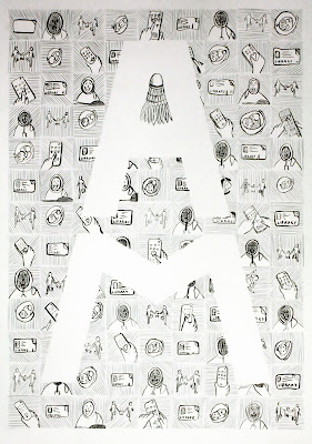
Here is my final outcome. To reach this outcome, I developed my idea a great deal both in my sketchbook and by making design sheets. From my peer feedback, I noted that none of my 5 previous ideas were really strong enough to develop into 1 final outcome; I completely agreed with this which is why the ideas for the final outcome that I came up with included all 5 images as they were visually more powerful as a set.
Here I tested, played and evaluated what was working well and what wasn't. I did focus on just one type of idea which I feel I could of developed more but in the time frame given I felt this would be bad time management. I liked the idea that led to my final piece and you can see me trying this out in the last image belowe. I purposely scaled it up from my sketchpad ideas to A2 as this is the size that I would be working on. I wanted to see if the Quink ink and coloured pencil were as effective on a bigger scale; they fortunately were.
Here I tested, played and evaluated what was working well and what wasn't. I did focus on just one type of idea which I feel I could of developed more but in the time frame given I felt this would be bad time management. I liked the idea that led to my final piece and you can see me trying this out in the last image belowe. I purposely scaled it up from my sketchpad ideas to A2 as this is the size that I would be working on. I wanted to see if the Quink ink and coloured pencil were as effective on a bigger scale; they fortunately were.
Here is a close up of my final piece. I incorporated the shuttlecock into the 'A' not just because it was a quirky, playful detail but because it visually makes the image as a whole easier to read for the audience.
This task as a whole was really enjoyable, though it was a lot of work, I am fairly pleased with the final outcome and this success is reiterated from the positive feedback that I received from my peers. Some of this feedback was that it was "A really nice final outcome that meets the brief well. But could of tired and tested some different ideas.", "clean structure and visually appealing looking into 'AM' through negative space." and again "more variation in early stages".
Here is a close up of my test final outcome.
Tuesday, 15 October 2013
Initials Brief- Development & 5 images
For this brief, we got given a partner and had to find out a lot about them and compile a list of information that sums them up. From this list, we drew 128 images, 64 for their first initial (A) and 64 for their second (M).
1. Family
2. Ambition
3. Home
4. Badminton
5. Disney
6. Crazy
7. TV
8. Books
...these are the words I focused on for the 128 images which are shown above.


1. Family
2. Ambition
3. Home
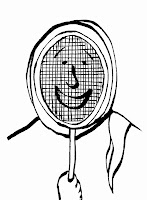
4. Badminton
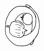
5. Disney
6. Crazy
7. TV
8. Books
...these are the words I focused on for the 128 images.
Drawing these 128 images proved a challenge. I felt that doing 128 images that included an initial in monochrome at a specific size felt very constrained and is not what my usual drawing approach is. However, these limitations are good for practice of real world briefs and I learnt a lot about how to scamp properly from this task.
We then needed to refine them down to just 5 key images that worked the best. Above are the 5 ideas that I thought communicated my friend's personality the most. These 5 images are the basis for my final piece that I will have finished by Friday 18th October. The aim of my 5 drawings was to communicate the idea rather than being visually attractive which I feel that I achieved.
Some of the feedback that I received from my peers over my chosen 5 was that they "answer the brief", the hug drawing was "cute", the TV remote "gets the message across" but I "could incorporate letters into the remote" and also that my badminton drawing "reminds (them) of Nick Sharatt".
Tuesday, 8 October 2013
Summer 10 Brief Re-design Part 2
Here is the finished piece for my Summer 10 Brief redesign.
- They poo on you
- They steal your food
- They go around in gangs
- They are bigger than most babies
- I would definitely lose in a fight against one
- They have a misleading outer appearance
- They ruin people's day
- They make small children cry
- They are probably very strong
- They scream a great deal
I enjoyed the lead-up to the final piece more than doing the final piece itself. Through the lead-up I gained a greater knowledge of materials and how they work on different papers. For example I had never worked with Quink until this project, so gaining an understanding of the properties and the way that this ink works was really interesting. Quink became something that I was really liking in my sketchbook as it provided some great tones when us as a dry brush. For my final piece I used white card because it is a slightly better quality than the paper provided (and i also thought that bright white instead of a dull creamy colour would look more professional). To my disadvantage, this white card's surface is very flat compared to the paper in my sketchbook so when trying to get these nice tonal effects, like in the second bird on the previous post, it did not work that well and left unappealing brush marks. This made it very difficult for me to achieve a good quality line work.
As we were only allowed to use analogue methods, I decided that my typewriter would be suited to this as type is much easier for the viewer to read than handwriting as it understands the letterforms- it is especially favoured when it is small.
Overall I have found this brief really useful for learning. However, I am not really pleased with the final piece and feel that the approach that I have took to the piece (the delicate brushed Quink) does not suit the tone of the idea that I was trying to communicate. Something better suited would be gouache to get big block colours, maybe also with a black outline.
It was great to look at other people's work. The variety and range is extraordinary. Everyone takes different approaches and uses different techniques to produce their outcome. And often, people's personality shines through their work which is really nice. I received some feedback on my work from a few people- most people liked the idea more than the visual image itself- I completely agree.
Monday, 7 October 2013
Summer 10 Brief Re-design Part 1
To follow on from the Summer 10 brief, we were asked to expand on one of the ideas/drawings that we made and turn it into a guide/comic/collection/poster. To do this, I looked through my work and looked for pieces that I thought could be improved or had ideas contained that I hadn't yet explored. Some of these ideas were:
- 10 Ways to get on TV
- 10 Reasons why I don't like seagulls
- 10 Things you will find in a biscuit tin- apart from biscuits
- 10 Things you can do with a pan
- 10 Ghetto uses for a pan
- 10 Reasons why I love brogues
I developed and thumbnailed a few of these ideas but the most prominent one and the one that my peers liked the best was the seagull idea. They said that it was "lighthearted" and would be "funny". From this point, I started to develop this idea by drawing lots and lots and lots of seagulls and fine tuning my 10 point list of why I didn't like seagulls. On the right are a few seagulls that I drew that I particularly liked; the final one (below) is the one that I chose to trace over and use on all of my 10 pieces. The reason why I wanted to use the same seagull on all my pieces was because I felt that the continuous seagull on each of the 10 drawings with the situation and surroundings changing would add a little humour to the piece and give whoever sees my work an ease of viewing.
Saturday, 5 October 2013
Summer 10 Brief
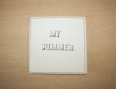
Here is my response to the brief that was set during the Summer. I created a book that demonstrated what I had been up to over the Summer by using little drawings, adding a caption and binding it together. Above are just a few of my 10 drawings. I really enjoyed this brief and wish that I had given myself a more little time to work on it as I found myself rushing it towards the end. I tried to make each drawing interesting (and sometimes humorous) by not being too literal nor showing an excess of information. It was really great to look at everyone else's work and it gave myself an insight into the people who created it and the way in which they work.
Below is some of the feedback that i got from the rest of the group on my book.
The Stupidest Brief Ever
Here is my response to a brief where we were asked to create a design that would make people smile and put it onto our garment of our choice. I chose a hoodie as i thought it would be a little more interesting than something like a tshirt. I toyed with many ideas including one that many people liked where a man was dropping some food with the caption 'Drop it like it's hot' in reference to the popular Snoop Dogg song. Despite this positive feedback, I thought that it would be more interesting if my work would incorporate the hoodie itself so I started placing objects inside the pocket. My most prominent idea was a horse relaxing with his feet up and it was the once i chose to progress with for the final idea. Because of the amount of time I had, i did not get chance to finish it's legs so instead I turned them into a banana as it suited the banana yellow colour. I would of liked to have been able to finish this design however it has sparked some ideas about having hoodies/garments that incorporate fruit and veg. Who wouldn't want a hoodie with a pineapple poking out of its pocket? Overall, I am not too pleased with the outcome visually as the line quality is poor and the drawing was not too good either. This was mostly likely due to the wooly material of the hoodie and also the time frame. However, I feel that the idea itself and the learning from this task was good.
Subscribe to:
Comments (Atom)


